Longtime readers of this blog will already be familiar with the name Silver Ferox. For the uninitiated, that evocative moniker belongs to an English graphic designer (based in Ireland) who has managed to achieve what many in his field can only fantasise about. Through a strong work ethic and a real love for cinema, he has managed to establish himself as an artist who specialises in a particularly rarefied niche - print design specifically for horror, arthouse and exploitation films. What began as a personal passion project (the creation of alternate/fan posters for genre movies from the '60s - early '90s*) has grown into a boutique studio with an expanding portfolio of artwork for vinyl soundtrack LPs, home video releases, posters, book covers and more. In an industry where very few design graduates end up with a career that intersects with their artistic interests, Silver Ferox may just be living the dream.
He recently took some time out from his work to answer some questions for the Eye. For any young designers hoping to realise your dreams and carve out your own specialised niche, I strongly suggest you put down your Wacom stylus for a few minutes and have a read.
*Posters that - to the consternation of bare walls everywhere - exist only as jpegs.
EYE: As a graphic designer who specialises in horror design, how difficult was it to establish yourself in such a niche field?
SF: It came together relatively quickly, maybe a few years or so. The key was to regularly post new work to keep my online presence growing, initially involving twelve hours a day at my workstation. A few key commissions also helped spread the word, such as THE HOUSE ON THE EDGE OF THE PARK PART 2 (which has yet to happen) along with INBRED and regular posters for CIGARETTE BURNS CINEMA screenings. This is definitely a passion project that's branched out into a boutique design service.
The creation of alternate and fan posters for vintage and contemporary cinema alike has grown into a thriving industry. What is the true value of this form of design? Why is it so endlessly attractive to us?
Alternative movie posters have an opportunity to highlight a movie's less familiar or more subtle imagery, or put a different spin on an iconic image and utilize layouts and rendering techniques that demand a certain contemplation that's generally opposed to the commercial role of 'official' movie posters which promote imagery and text aimed at instant recognition in order to sell the movie. Certain references can often only be understood if you have already seen the movie, too, which is an exclusive experience and in contrast to the function of an official poster. You could see a movie ten times and then come across a decent alternative movie poster or fan art interpretation that will suggest a new angle and is one of the main reasons why it can be so appealing to buffs. Unfortunately, in some circles the term 'fan art' is often used in a derogatory sense, as if by nature it's not as valid as an officially commissioned (by the original movie producers or distributors) poster, but to my mind, if you're creating out of personal passion then you are likely to imbue your artwork with a certain energy often lacking in a lot of commercial output.
One of the things that make your alternate posters stand out from the crowd is that rather than recycling the familiar iconic imagery from a given film, you often use more obscure elements and imagery instead. A good example of this is your SCANNERS poster that features a shot of Benjamin Pierce's artwork. The effect of this for me is to get directly to the heart of a film's themes, symbolism and deeper meaning. Is this something you're very conscious of when compiling images for your designs? What is your process for choosing your stills?
Finding and using less familiar images from these films keeps my process interesting to me since there's that feeling of charting new territory. Conceptual designs aren't my priority, since I have no direct requirements for my designs, but if it occurs organically, if the images I use suggest this way or that, then it can be surprising to me when I see what occurs. Sometimes I place various images together to create a relationship to support the movie's theme or a key concept and other times I find a single image that within itself might do the trick and that's one of the pleasures of dealing with imagery from a director such as David Cronenberg. Cronenberg's early works, particular favourites of mine, incorporate literal, physical depictions of his concepts and the visuals are almost like prefabricated poster montages - they suggest whole strings of narrative in a single shot. Benjamin Pierce's sculpture in SCANNERS is a perfect example of Cronenberg giving visual form to that movie's themes and other examples would be VIDEODROME's Max Renn having a VHS cassette inserted into his abdominal VCR slot and THE BROOD's embryos of rage developing on the outside of Nola Carveth's torso. Metaphor is a cornerstone of creative filmmaking that Cronenberg frequently takes beyond its usual limits. Regarding the Pierce design, I was fortunate to be able to construct the image from panoramically stitching together several screen captures as the camera pans down from the top to the bottom of the sculpture as shown in the movie, since that shot as a whole didn't appear nor could I find any movie stills that were originally taken of that piece. I used the same screen capture stitching technique to present Nola Carveth from head to toe for my THE BROOD design too, since even though we do see her in full in a long shot, I was able to get a much clearer and higher resolution image through merging the close-ups.
When it comes to building up of a database of images, the process involves much scouring of the internet for high resolution photos alongside scanning through the Blu-ray (if available) to take screen captures and also occasionally buying a lobby card set from which I can scan. It's a procedure that can take months even years until I'm satisfied that I have collected the best selection of images available from which to choose the ones I want to work with.
You've been doing a lot of very striking LP design. Between one-sheets and albums, which do you have more fun with these days? Why?
Gatefold vinyl packages have a minimum of four panels (front, back and two inner) plus the two record labels (and in the case of One Way Static, there are frequently insert sheets offering a further two sides), so it can be a real kick to have this much space for your layout. However, since I use photo images almost exclusively, there's a degree of image delegation that comes with designing the lps which is managable enough if you have an abundance of images but challenging if you've only a few to hand. Concerning posters, my clients tend to want one sheets to look like one sheets (so I leave more radical designs to my private work) whereas you've more scope for a variety of aesthetics when it comes to lp design. Truth is, I enjoy doing both equally.
I'd be hard pressed to pick a favourite out of your LP designs, as I think they're all fantastic. Do you have a personal fave?
I'm glad you like them, thanks. At the moment, the back cover for THE BURNING came together in a rewarding way for me. There's a scene early on in the film that shows the killer Cropsey's POV as he walks the red light district at night that's especially gritty and carries an urban tone that I wanted to utilize somewhere in the design as a contrast to the movie's wilderness setting. I eventually merged four screen captures together relating to that street scene and in so doing was thrilled to notice that the neon marquee sign read 'Sensual Fire'; something I hadn't noticed on a multitude of previous viewings.
I happen to think that there is a co-relationship between what is caught on camera and a movie's inherent themes that appears in ways that many would label as pure coincidence, a relationship between the psyche involved in the experience of filming and that which is filmed that often results in direct manifestation of the artist's intents. Discovering these gems is all the more exciting for me since it affirms my belief in how our physical reality reflects our internal state and gives me the opportunity to engage with the uncanny in a very conscious way.
Can you name some of the poster designers of the '70s and '80s who have been most influential on you?
Growing up, it was really the actual visual impression of publications such as MONSTER MAG then STARBURST and finally FANGORIA (which I happened upon in the local news agents in 1981 and was the answer to all my prayers) that influenced me the most. A FANGORIA cover alone, with its combination of killer images and display fonts along with that genius film strip along the left side that you could spot on the rack from a mile off was enough to put my brain into overdrive. I never researched movie poster artists until quite recently and discovered that Enzo Sciotti, Renato Casaro, Tom Chantrell, Batiste Madalena plus a host of uncredited Czechoslovakian and Japanese designers are amongst my favourites.
Are there any contemporary genre poster designers who you particularly admire?
Signalstarr, Graham Humphreys, Jay Shaw, Brandon Schaeffer, Slasher Design, Eric Adrian Lee, Sadist Art, Midnight Marauder, Nathan Thomas Milliner, Adam Juresko, Gabz, We Buy Your Kids... so much talent around right now, these are just some that come to mind.
Ever since Billy O'Brien's haunting ISOLATION hit over a decade ago, we've seen a fairly steady stream of excellent horror movies produced in Ireland. What are your views on the local genre film scene? Is it healthy and growing? Any personal favourites you'd like to share? How about any hidden gems that came out pre-ISOLATION that the world at large might not be aware of?
I haven't seen ISOLATION so I'll add it to the list! Being a bit of a hermit, I'm not hooked into the local scene but I did enjoy an indie zombie movie DEAD MEAT (2004) that had its finale shot at a castle ruin just up the road from me and, coincidentally, very near a house that was apparently Tisa Farrow's (Fulci's ZOMBIE) childhood home.
Your designs span a huge amount of directors, from Argento to Zulawski. Who are your top three desert island filmmakers?
David Cronenberg, Dario Argento, John Carpenter.
Thinking now about the new generation of filmmakers, who are your favourite contemporary directors? What are some of your most loved films of the last decade?
Tough question! Looking at my movie shelves, I struggle to find any movie made after the early nineties. I'm just not focused on contemporary directors and although I try to keep up with the latest horror movies, they often turn me off with their overly edgey atmosphere and realism. BLACK SWAN comes to mind though, as being a psychological and visual beauty.
As a middle aged horror fan, I've watched it go from a counter-cultural scene in which CANNIBAL HOLOCAUST was discussed in hushed reverence, to a world in which Deodato's film can be bought - uncut and high-def - at the local mall. The way I see it, the mass acceptance and commodification of the genre has brought with it as many negative changes as it has positive. Cute plush toys based on the works of Lovecraft and Romero piss me off. Your thoughts on all this?
While it's certainly great to be able to pick-up anything these days at the click of a button, I think that for many of us forty-something plus and especially in the UK or any other country where it was a crime punishable by imprisonment to simply rent certain movies deemed offensive, when it first came to getting hold of most of the movies we love back in the early 80s, the thrill of the hunt was a massive part of the whole scene. I remember travelling from the UK to Amsterdam when I was 17 on a mission to buy and smuggle back whatever uncut VHS I could (an uncut Dutch TENEBRAE was my prized possession amongst a handful of titles I managed to convince a rental store to sell me). That rush of adrenalin I felt walking through the NOTHING TO DECLARE Customs queue with a rucksack full of uncertified VHS and the subsequent feeling of exhilaration when I passed through unchecked was immense.
Plushies or kitschy interpretations of cult movies do seem to be curiously popular — just not in my household! I wouldn't mind the commodification, if only what was being sold was aesthetically true to form. It's like admiring a suit for its fine natural fabric and exquisite cut and then saying "Let's make this suit again, but in polythene and let's change all the proportions". You end up changing the form from the very thing that made it desirable (to me, at least) in the first place.
Fan posters:
Poster for horror short TLMEA (dir: Kevin Kopacka):
Vinyl OSTs for One Way Static Records. First up, MARK OF THE DEVIL and its sequel:
Special and standard editions of CANNIBAL FEROX:
Joe D'Amato's PAPAYA: LOVE GODDESS OF THE CANNIBALS:
Craven's THE HILLS HAVE EYES:
CANDYMAN 2, score by Philip Glass:
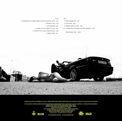
OST for 2013 "fuck film" COPENHAGEN CLIMAX (dir: Fredrick von Liljewahl), on Salon Elegance Recordings:
Submission for DVD release of Khalfoun and Aja's MANIAC remake:
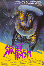
Box art for Mega Films' VHS release of STREET TRASH:
Book covers for FAB Press and Bear Manor Media:




_poster.jpg)










Thanks for the opportunity to chat about my favourite subject (and on a site I've been following for at least five years now). Long live the EYE!
ReplyDelete